Perhaps I should clarify: it's not that I think that part doesn't look right for a sensor system, or something that houses a sensor system; I just don't think that part of the ship flows with the rest of it. When it comes to making up your own sci-fi universe, I really see no problem with separating form from function, however. 
-
-
Looking back on it, I'm actually in agreement with everyone who said they aren't too fond of the sensor tower. The original profile sketch I created had the tower standing as a much more integral part of the ship; less horizontal distribution of the hull, and in that situation, it looked really cool. I'll be going back to re-do the model when I get time for it.
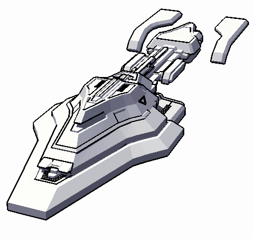
In other news, I got bored the other day and thought I'd try my hand at modeling a ship starting with a shape OTHER than a basic square. Here's the result.

I'm quite happy with this little thing. It's not done (note the levitating plates near the back), but overall it gives you an idea of the frame. Also, before any of you go thinking that I've changed my usual armored take on starship modeling and finally placed a windshield atop the front of the ship there, be not confused; it's a weapon port. This ship is actually fairly small, and that opening houses a nichron cannon that takes up pretty much the entirety of the forward upper decks. Overall, the ship still holds living space for a decent crew of 73, though like most ships of NDC origin, it's mostly weapons and armor comprising the total hull's mass. I'll admit, I was inspired by two sources to create this vessel: the EV Nova "Starbridge", and a World War II german bunker.
Add. Notes - The image was treated in photoshop quickly after being captured to remove several jagged edges and to add basic color.
-
I like this a lot better than the upside-down pistol from earlier, truth be told. It sort of looks like a more angular version of Star Trek's Intrepid-class, really. I like it.
-
Hmm.
Sorry I didn't look in on this thread earlier. If you need me to come and look at something, the best way to grab me is via a PM here on the boards.
We ran into exactly the same problem in LightWave when imported our first DXF files, way back in the late 90s. The problem comes about because of the way LightWave interprets point data and polygon data. It determines flatness in the same way as OpenGL; that is, a polygon is "facing" in one direction or another based on which way around its points are connected. If they're connected clockwise, it'll face one way. Counterclockwise, it'll face the other.
Most modelling tools don't care about this kind of facing direction, but LightWave does. There are some very valid technical reasons why, but I won't detail them here.
Setting the polygons to doublesided is only a temporary patch, too. It won't fix the underlying problem, which is that some polys really aren't facing the right way. You need to fix these up manually. Sorry, but that's just the way the cookie crumbles.
I model inside LightWave, which fixes the problem. It is neither an easy tool to learn, nor a simple one to use. However, the results do justify the extra time spent, if maximum quality is what floats your boat.

More to come, probably in a different thread.
-
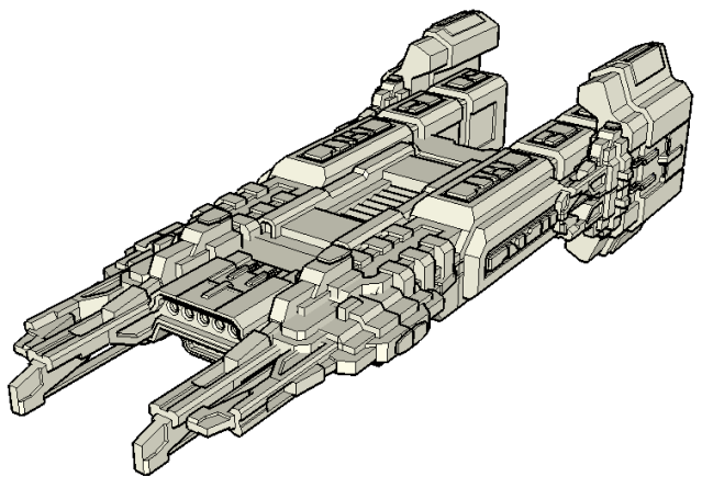
Alright, I'm hoping you'll all really enjoy this one. I spent quite some time on it (3 hours). Funny story about how it came to be; I was perusing my collection of unfinished models or good concepts for individual ship parts that never became full ships, and I got this idea to try gluing a whole bunch of incomplete parts together, and even sharing parts from some already completed models (namely, the NDC station). After some careful placement and decided creativity, I came up with this beauty.

I'm not sure what to call it yet, but I like the sort of "talon" design toward the front, so perhaps a name relating to a bird of prey or whatever. One thing is for sure, this is going to be one of the larger ships in the game, to show off the detail.
Not really much more than copy and paste work. Amazing what you can build with the right bricks.
-
head asplodes
Three hours? That's really very little time to come up with something that great! I've spent far longer developing far lesser creations. Superb work!
On second glance though, the blockyness is actually a bit pronounced. My completely amateur advice would be to tone down the number of primitives you placed around the hull.
Again though, excellent design! I especially like the gun embankment on the front. You know, on third glance, it actually looks a bit like my Fed Heavy Destroyer on a superstructural level, but with lots of extra awesome.
-
http://en.wikipedia.org/wiki/Bird_of_prey
Yeah, so I did a search.
 But the only menacing names are either Vulture, Harrier, or Falcon.
Perhaps try a mythical beast of sorts?
-
QUOTE (Ianator @ Apr 30 2009, 06:36 PM) <{POST_SNAPBACK}>
That is beautiful. And for something stuck together with parts of a bunch of other ships, Chimera might be a fitting name.
Heh, that was what I was going to suggest.

-
I was leaning towards "Phoenix" or "Justicar," myself, but Chimera is good, too.

-
By the way, first person to make a "built this in a cave from scraps" comment about my cutting and pasting loses beta-testing rights.

I'm just kidding, of course. We'll just see if any of you live long enough to see the beta. I know I've been on this for quite some time with little to show for it. It's a difficult process especially with the rest of life slowing me down.
-
I don't know, I think the extra greebling on the hull (extra primitives) really adds to the subtle detail on the finished model.

I'll leave that up to you, though.

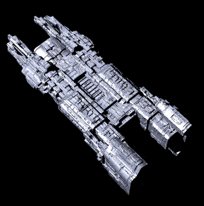
Also, yes, I know it's washed out. I didn't bother messing with the lighting when I rendered it, and it's too big for my usual render "set", so the whole thing was too close to the light source.
This post has been edited by Delphi : 01 May 2009 - 12:58 AM
-
zOMG! A double-post from one as reputed as Delphi?! (And a chat-room term from Archon?)
Ah, I think it's justified though, if for no other reason than to treat a few folks who would have looked past it to a sweet, sweet look at that little beauty of a ship! I agree with you now too; the extra primitives help add a sense of scope when it's rendered (and textured; that may have been part of it before).
The texture itself really adds to the feel too, the lack of any real noticeable paneling on it makes it look even more gargantuan.
Now excuse my while my pride over my own paltry 3d skills shrinks into insignificance in the face of such a masterpiece! :hector_bird:
-
Delphi, that is one remarkable thing of beauty. Kudos to you!
-
Geez I haven't been on these boards in forever, just stopped back in to see what great things have been wrought. And man am I impressed! Delphi! These ships are just so amazing! I cannot wait for this, but I must! And hell, even if I am 40 years old, I would load up EVN just to test the beta. Keep working at it!
-
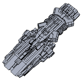
New ship time! I'm quite happy with the design on this one, especially because I borrowed heavily from scrapped projects. Just shows that some of the best things you'll ever design come from the junkyard. There were a few parts used in the previous model that you might recognize, but I tried to go a different route with this one, and it came out to look very unique. It's hard to see with only the stationary overhead shot, but the vehicle hangs down toward the front half, giving it a good two-part raised and lowered design. This may find its way into the plug as either a dominant or a heavy cruiser, but either way I'll make sure it's big enough to have some fun with.

