Ambrosia Garden Archive
    • QUOTE (Archon @ Jan 17 2010, 02:39 PM) <{POST_SNAPBACK}>

      I have no idea how I'd render the spin on that, if the dots would animate and kind of swirl around one another or what, but that's something we can think about later. (Edit: actually, I'll probably just spin the wireframe part of the image; easy to do, easy to understand.)

      😉

      Only thing I can think of that would be really annoying would be that with this method and the running lights trick, it would be impossible to tell which way a disabled squadron was facing and hence it would be tough to board, but I think fighter squads would be best with 0 crew anyways because boarding them doesn't make much sense. That may get in the way of fighter reclamation, however, but I don't know if 0 crew fighters can be reclaimed.

      Come to think of it, a disabled squadron really makes no sense whatsoever. Perhaps it would be best to give them no defense status display (probably a good idea regardless) and 1 armor so that they die as soon as they take a hit at 0 shields. That eliminates a serious cool factor (the running light fade on disable) but if you give it a long enough death count it should get the same effect.

      In fact, for explosions on destruction, perhaps you could even give the ship itself a like 1-2 frame count, and then, assuming the fighters don't move within the sprite as they turn, you could make the "explosion" a longer animation of the dots slowly blinking out (maybe a few veering wildly off). Takes off a bit of the "Huh?" factor when you shoot a squad enough that every ship dies at the exact same time. :laugh:

    • You don't need to take away the defense status as fighters are notorious for having incredibly weak armour, anyway.

      On a side note, has anyone else noticed this is the only active thread on this part of the boards?

    • Part of the reasoning was that seeing that the entire squadron's shields are at a fixed percent seems a little goofy.

    • Good point. Perhaps it could be explained away as the percent of the squadron left? Well, no that wouldn't work because then you'd have to eliminate shield recharge on fighters.

      Maybe it could simply be the average percent of shields of the squadron? A little odd, but it could work.

      You know what? Forget it, Archon's idea of no defense status is better.

    • QUOTE (darthkev @ Jan 18 2010, 10:30 AM) <{POST_SNAPBACK}>

      Alright, then. Archon, from your example picture I've thought up a design for your idea. Basically looks the same as yours, but green. I just think green would stand out more against the usual black of space. The target image would be normal size (128x64 pixels) with a green box around it and a green line shooting off from 7:30 (that's south west) to the center of the fighter sprite. You could even incorporate the ring into the light image forcing the player to have to actually hit the fighters and not just the area around them.

      This is actually because the human eye can pick up the colour green the best. That is a reason stop lights turn green as well.

      I like the idea of the dots with the overlay, it gives you a better feel. If anyone has played Sins of a Solar Empire, you can see that it also does this a bit, with a little thing representing a squadron. It works pretty well!

    • QUOTE (Delphi @ Jan 12 2010, 12:10 AM) <{POST_SNAPBACK}>

      Okay, that's one pass done in both Bryce and Photoshop. No detail map added yet. Just the base texture. This thing already looks like it could seriously cause some harm.

      I personally think that since you model every detail, the ship could do without a paneling texture. Say if you were making a borg cube, and you had a plain square, it would make sense to use a texture like that. Your modeling abilities are way beyond that, however; the people who use those textures would kill for what you can do with polygons.

      The combination of the two detracts from the actual detail of the ship; we can no longer tell which texture is simulated and which is real.

      I think your ship should be the texture. Use grunge textures to make it look weathered, add govt. insignias, and you're good to go IMO.

    • I agree, this ship already looks mostly finished as is. It just needs some insignias and the like, as Insomniac said, and it's done! Of course, if you still want to do the texturing, that's up to you. 🙂

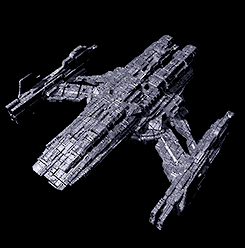
    • I must admit, the ships with extreme levels of detail don't need much of a texture map. Geez they really slow down the system though. I like the idea of just adding general grunge, and I also had the idea that I could use a semi-transparent layer of full black or darker blue just to shade certain parts of the ship, whereas lighter metals would shine through the clear spaces. It'd basically just be a shade layer, instead of a full texture map. The basic metal would still be underneath (I use it on EVERYTHING) but I'd worry less about surface maps and more on general definition of structure through the clever use of darker regions. For instance, if I make a small darker edge around the hull of the Harbinger, it could really bring out the spine of the craft.

      The Alexander looks REALLY good with just a basic texture. I'll probably not make too many modifications to it.

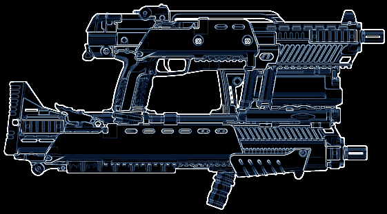
      Also, with many thanks to DoctorNoob for creating Pimp My Gun, I messed around for about an hour with multiple weapon parts, and after a quick pass through photoshop, I successfully designed a decent heavy rifle for the NDC. It looks really spiffy. Check it out.

      I might use that one as an outfitter picture. I had this idea that instead of purchasing "marines" to help capture ships, you'd just outfit the crew with heavier gear. It doesn't matter if you've crammed 100 soldiers onto your freighter if I show up with twenty power-armored warriors with ship-grade electromag cannons. Besides, that always bugged me too; the fact that with the right number of upgrades, I could fit nearly 10 full marine squads onto my tiny little Starbridge.

    • While that did bug many people (thus prompting many TCs to have marines take up cargo instead of space) your Starbridge wouldn't fit much else after putting in all those marines.

    • But it's like sticking clowns in a van; from the outside, it just doesn't look like it should work.

    • Good point. After all, the Starbridge is only 20m long, so fitting ten Marine Squads and the standard crew of two would be difficult. Each Marine Platoon grants the player 25 extra crew members, though I suspect it's only five crew members, each marine capable of handling five standard crew members at a time. Still, that's 50 extra men stuffed into that tiny ship.

    • Not really much to add here thus-far other than: keep up the amazing work. The screenshots are lookin' good.

    • QUOTE (Delphi @ Feb 3 2010, 09:34 PM) <{POST_SNAPBACK}>

      The Alexander looks REALLY good with just a basic texture. I'll probably not make too many modifications to it.

      Yeah, definitely like that ship.

    • Here's a little eye-candy for you. This is a full-sized screenshot from the TC. Though the game is far from done, this is an example of what I call "100% on-screen conversion", meaning that I can fly into at least a few systems and not see any of the original Nova content. The planet, the HUD, the ships; everything is original to the TC.

      http://i47.tinypic.com/mrtsmb.jpg

      Also, Photobucket tends to compress the images and cut out sprite clarity. TinyPic does not, so you get this one in full detail.

    • I believe my underwear needs changing after having looked at that. We need to invent a new word that surpasses super-amazingly-beautiful, Delphi. Phenomenal work.

    • Wow... that's just... wow... ... no words for it... I... wow...

      Delphi, I worship your graphical design skills... wow...

      On a side note, those asteroids are still Nova. But then, most people reuse those. 😉

    • That's so beautiful, I might have to shed a tear.

    • I am ashamed, but I cannot seem to actually find a reposted history of the universe, and my memory of what was said in the ev-nova.net thread, back in the day, is, er, not as detailed as I wish it to be.

    • Is that a vertical energy bar I spy? Nice!

    • As good as of an idea a vertical energy bar is, I'm afraid to say that it's terribly difficult to see. The rest of the sidebar is excellently done. That's insane.