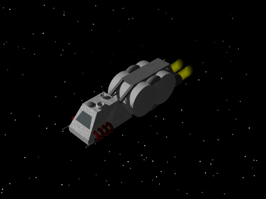
Heres a ship I'm working on, what do you guys think so far?

------------------
-----
Paul "Haust"
Giampaolo
prg@smellycat.com
Heres a ship I'm working on, what do you guys think so far?

------------------
-----
Paul "Haust"
Giampaolo
prg@smellycat.com
Not bad.
------------------
Mac OS X Rocks!
(nitpicking)Quite good, exept for the engine glows. I don't think the a real engine blast would look exactly like a cylcinder...(/nitpicking)
Otherwise, very good!
(edit)Spellfix(/edit)
------------------
Die, Cruiser, die!
--Last log from Scoutship 4299--
(-Random Mod Quote: No. -mcb-) (url="http://"http://www.geocities.com/toreetosys")ToreeTo Systems(/url) Now with Plug-in Pics and fixed URL
(This message has been edited by dashriprock (edited 05-15-2002).)
Well, the engine glow is gonna need some work. I just added it real quick because I wanted engine glow in the pic and hadn't yet decided how exactly how I wanted to do it in the final version. If anyone has any suggestions for doing good engine glow, I'd be glad to hear it.
------------------
-----
Paul "Haust"
Giampaolo
prg@smellycat.com
Generally, most good engine glows are sort of deformed spherical shapes. There are some conical glows, but they only look good on small fast ships.
Matrix
------------------
"Nothing is fool-proof to a sufficiently talented fool."
I forgot to mention that engine glows will always have a hot core that cools as the glow radiates outward (ie. yellow --> red, or white --> blue, etc.)
Matrix
------------------
"Nothing is fool-proof to a sufficiently talented fool."
(This message has been edited by what_is_the_matrix (edited 05-15-2002).)
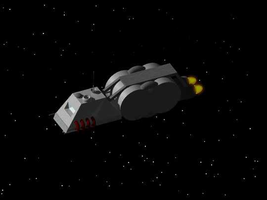
Thanks for the tips, I redid some stuff including the glow. Heres a look at the current state of things.

------------------
-----
Paul "Haust"
Giampaolo
prg@smellycat.com
I'd suggest adding tori+cylinders or squashed spheres to the sides of the central cylinder thingies; the sharp edges on just a cylinder don't look right, and this would help fix the large area of flat color produced by the ends.
------------------
(url="http://"http://www.rit.edu/~jxc1906/")(Insert Signature Here)(/url)
What are you using for your graphics? Turn off ambience, or at least make it black. It looks weird that in space your ship is partially illuminated on the shadow side. I believe that I made a post about this before
Ambience=bad. My SoftImage teacher takes off points if we use it. The reason is that you have less values to use across the model, making it look flatter than it really is.
I like your glows.
I agree that you should put something on the sides of those aft cylinders to give them some dimension. Generally speaking, large flat sections of ships look weird. I like to just add some thin cylinders, or some small spheres to break up the surface.
Matrix
------------------
"Nothing is fool-proof to a sufficiently talented fool."
I'll try something for the cylinders and turn off the ambience. I'm doing this with Strata3D Base btw. I'm debating shelling out the 199$ for plus...
------------------
-----
Paul "Haust"
Giampaolo
prg@smellycat.com
Quote
Originally posted by Haust:
**I'll try something for the cylinders and turn off the ambience. I'm doing this with Strata3D Base btw. I'm debating shelling out the 199$ for plus...
**
Sorry to say this, but you might have to. I've heard that base doesn't allow rendering animations, which you'll need to do when you want to turn it into sprites.
Matrix
------------------
"Nothing is fool-proof to a sufficiently talented fool."
hey now! I use base, and you can hardly call my work bad(regard my latest post on the image gallery if you disagree!). All you need to do is group everything, then rotate if by 10 degrees using the object properties window, then render it. That may be inconvienient, but it's worth saving $199!
------------------
(Insert Clever Remark Here)
Yeah, thats what I was planning on doing for conversion to sprites. Yeah it is a bit time comsuming, but it saves money, which is very good as any college student will tell you.
------------------
-----
Paul "Haust"
Giampaolo
prg@smellycat.com
You're right about ambience (its bad... especially in a space scene... no atmosphere to diffuse light around) but at least when rendering the sprites its a bit necessary... If you have completely black areas on the ship (total shadow) it makes it much more difficult to create a good mask... At least thats my experience. I use a very small amount of ambience for the sprites (like 5% at most) just enough to make sure the shadowed areas arent' completely black. 
------------------
Yea, it'd make it easier to make masks. If you used the full versions of stuff, and could render your sprites as an animation, you just render it once with no ambience, and once with a perfectly white ship. Ta da! You have your ship, and you have your mask.
Matrix
------------------
"Nothing is fool-proof to a sufficiently talented fool."
The other way to do it with no ambience is to render the ship against say a bright green background.
Matrix
------------------
"Nothing is fool-proof to a sufficiently talented fool."
Quote
Originally posted by what_is_the_matrix:
**Yea, it'd make it easier to make masks. If you used the full versions of stuff, and could render your sprites as an animation, you just render it once with no ambience, and once with a perfectly white ship. Ta da! You have your ship, and you have your mask.
Matrix
**
Also remember that when you are rendering the mask to turn anti-aliasing off or the mask will be too small due to the greys being cut out of the ship. Im not sure whether that is very clear but I know what I mean anyway 
With regards the model, the weapons are a bit weak. Take time when making weapons, they can add a great deal to the ship as a whole. When I make ships, I generally start with a general idea in mind, draw that on paper. From that I can get a general idea of what the ship will look like. Then the first thing I model is the weapons, as I find it easier to model a ship with weapons already made as a sort of "style template" if you like. After that I model the rest of the ship in a similar style to the weapons. Other people's methods will differ from mine but I always think having a fresh perspective is always useful.
Keep up the good work,
ewan
------------------
may contain nuts
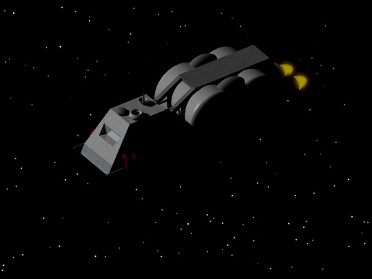
ok, heres a current version. Out of town at the moments, so updates on its progress will be slower.

Quote
Originally posted by Jules:
**Then the first thing I model is the weapons, as I find it easier to model a ship with weapons already made as a sort of "style template" if you like. After that I model the rest of the ship in a similar style to the weapons. Other people's methods will differ from mine but I always think having a fresh perspective is always useful.
**
Personally, I like to start with the fuselage/cockpit, and move outward. I tend to like to add the weapons last because more often than not, they won't be the right size, or will look awkward when attached to the ship. I, of course, finish with the glows and the running lights.
I do want to make one change to my statement that "ambience = bad". When you're modeling the ship, turn on the ambience so that all your parts and bits are visible, but when you make your final render, turn it off.
I agree with Jules, your weapons are on the small side. They're difficult to see on your ship. If it has weapons, advertise them by making them visible, and even add little glowing bits.
Also, something you might want to try is to move the lights onto the camera's side of the ship. It'll better show of the ships features. Currently, many of the details that were visible on your picture with ambience are in the shadow now.
Matrix
------------------
"Nothing is fool-proof to a sufficiently talented fool."
You know, it's rather silly to say that a space scene shouldn't have ambient light: there may be no atmosphere to diffuse a primary source around the ship, but there are lots of stars in every concievable direction. That said, from an artistic point of view ambient light is definitely bad - but no light at all on large portions of the model is usually worse. Throw on a very dim point or spot light or two to prevent any (visible) spot on the ship from going to black, and it should look better.
------------------
(url="http://"http://www.rit.edu/~jxc1906/")(Insert Signature Here)(/url)