Ambrosia Garden Archive
    • A little input


      On a big project...

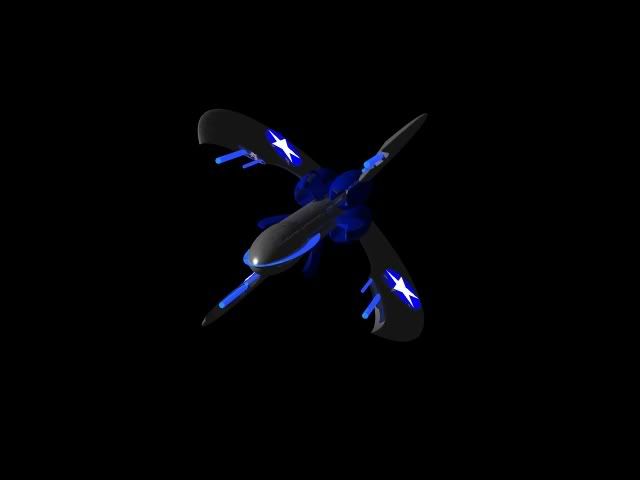
      OK, like I've said a billion time over, me and ToLazyToMakeAnAccount are making our own version of EVC (the EV original version for Nova), and I'm in the process of making at least one completely new ship. It is one of two ships of a class that aren't in the original E.V. The one I have worked on thus far is the Confederate Annihilation Carrier. There will be a Rebellion counterpart, but I still want input on the one I have made thus far.
      Posted Image
      Posted Image
      Posted Image
      Posted Image

      Here is the final preview image I have of it compared, in size, to the Confederate Cruiser (which I have re-modeled.)
      Posted Image

      I was wondering what suggestions anybody has. Just as a side-note, yes, I know they're low-detail, but it's because I don't have the skill to make anything better and I'm trying to keep a look of a re-vamped E.V.classic, not a Nova-level of detail. Suggestions?

    • Basic texture maps can go a long way. Even EV had texture mapped ships, at least in the shipyard views. I once made an EVC-imitation texture, I could post it if you want.

      The wings don't have the Confed Blue Circle emblem (which really is a blue circle with an inscribed white star - which I also have a texture for...it used to be available in Meowx's Texture Depot, and also Captain Skyblade had it.) Anyway, they're not Confed ships without at least a blue circle. 😉

    • I don't remember the ships in EVC being so shiney, or plastic-looking...

      Looks good though. The classic EV storyline and universe was by far my favorite.

    • Well, that's dandy. However, I don't really know how to do texture maps well in Bryce 5 (the program I'm using). I can make a floating picture, but that casts ugly shadows and I don't know how to set transparencies. If anybody knows of a way to do textures in Bryce 5, that would be great. So far, all attempts at texturing have turned disasturous and have failed. I seem to only be able to stretch a repeating texture all over a shape, and it's nearly impossible to align the annoying repeating texture in any organized or desireable way. So again, does anybody have any know-how or know of any tutorials on good Bryce 5 texturing? If so, it would help.

    • Looks pretty good. The only suggestion I would make would be to smooth out the cockpit of the cruiser to make it look less like an, um... (insert word for male genitalia here) ;), and more like a control station.

      Edit: dang, it will let me write cockpit but not break it into two words with a hyphen, essentially ruining my joke. These boards are out to wreck my comical ability.

      This post has been edited by PigDog4 : 03 March 2005 - 10:12 PM

    • One note is that ships in Escape Velocity look very much like they were rendered in Mechanisto. If you have a Mac, it's a relatively easy, free program to learn... and it has an excellent built-in texturing system.

      If you stick with Bryce, I must say that those ships must stop being so shiny. They can still be shiny, but that much shininess is too much. That and if you could add more detail on the wingtips. Confed/Reb cruisers, Confed frigates, Confed fighters, and even Lightnings all have yellow pointy things at the ends of some wings that point forward, that are presumably cannons. Without them, the ships just wouldn't look EV-y.

    • My comment is that it seems far too streamlined to be a carrier. Of course, that doesn't matter so much in space, but if you are trying to stick to the original's designs, I'd point out that the 'fed cruiser was pretty huge, and the carrier was massive. I figure that this is somewhere between the two, yet this reminds me more of a fighter.

      ~ SpacePirate

    • I don't have Bryce, but I've been working on something in Mechanisto. If you think it can be useful to you, I can email you the file.

      (Note) This is from after a trip trough Photoshop.

      Attached File(s)

      This post has been edited by Eugene Chin : 04 March 2005 - 10:28 AM

    • Eugene Chin, on Mar 4 2005, 03:27 PM, said:

      I don't have Bryce, but I've been working on something in Mechanisto. If you think it can be useful to you, I can email you the file.

      (Note) This is from after a trip trough Photoshop.
      View Post

      That is beautiful. I always was a fan of the improving of the old EV and EVO graphics.

    • Well, I certainly wasn't expecting this topic to get resurrected like this, but I have to say that this particular issue has already been solved. My new version of the cruiser is still pretty boring (however, I added some running lights on the side to make it look just a little less boring), and the Confederate Annihilation Carrier has been finished graphically. Its specs are still in-progress. I will show just one more preview of me and ToLazyToMakeAnAccount's project, after which point you'll have to sit tight.
      Posted Image
      That will probably be all until the project is done!

      Yes, the cruiser may be big, but the carrier completely dwarfs it. The ship's graphics alone are almost too big for Nova and Resedit to tolerate for any single object (I originally was trying to get it to be 640x480, but that caused many problems, so it is now 448x336.) It's supposed to be a little more than twice as big as a cruiser (though the Nova engine, as I said, doesn't like graphics getting that big.)

      This post has been edited by Fnoigy : 09 March 2005 - 02:37 PM

    • It's still too shiny. But on the upside it is very intimidating and looks much more EVCish.
      I wish you luck and great success.